
Feb. 22, 2023.
News flash! Instead of reading this very long blog post you can get all the tips below in my new ebook downloadable via my website at holIinrake.com. In fact as of March 7, 2023 this blog no longer shows the complete set so now it really will be best if you download the ebook.
Or you can keep reading here (please excuse any typos...there may be a few):
April 2022.
Starting a few weeks ago I launched my one tip per week campaign on LinkedIn to help you prepare for and get the most out of a professional portrait session. And all I said was: There are so many little things that can impact the success of a portrait. I hope these help.
I am going to expand a bit on that. I just want to add that everything I suggest is a guideline I’m proposing for your consideration based on things I’ve observed and encountered over many years as a photographer and retoucher. I am sure I’ll suggest things that give people pause and that seem (and in fact are) relevant only to some. I hope nobody feels excluded or offended.
I also anticipate some reacting with the assertion that many things can be fixed in post-production/Photoshop. For the record it is true that almost anything can be done in Photoshop, with the commensurate budget. But not only is that budget rarely available for difficult problems (in corporate portrait-land), it would just be a waste of time and money to fix something that could have been avoided in the first place with some care and planning. Another way of putting it is that there are ways to avoid putting you the client, and your photographer in the position of having to deal with a compromised image that could have been better, especially if the photographer can’t bear to let the image see the light of day without fixing it whether she is getting paid to fix it or not.
Another thing I want to mention, and this has occurred to me over and over again across the years whenever I have stood in for my own corporate photo examples, when I was hunting for clothes to wear for my Tips photos I was reminded how tricky it can be to wear the right thing, that looks good. I don’t know about you but I have tons of clothes that I think may not fit absolutely perfectly but I think they fit well enough, until I see them in my test shots. I may still wear them IRL, but I can’t wear them for the example shots because there is a deal breaker in so many of the garments I own (you'll see what I mean as I add to the tips below)…mind you I am trying to look sort of corporate in these shots, while I'm not corporate, and like many photographers no matter who the client is I wear a lot of black, which I keep telling people not to do for photos. The point is I feel you. Take a deep breath. And if you are not sure bring options (if that's an option...time allowing etc.) for your shoot.
Don't worry! Good luck! I know you will look great for your next shoot (especially if you follow all of my suggestions).
Just FYI, while I will create and post tips in no particular order on LinkedIn, I will add them here in order because...of course...
Tip #1 Breathe
Once you arrive at your photo session, breathe. Why would I say this? Because people filled with dread hold their breaths. I work with people all the time who come to portrait shoots geared up for what they anticipate will be a fairly short but painful nightmare, “knowing” they are unphotogenic and they will probably hate the results. They listen hard determined to get this thing over with and make it count! And they stop breathing.

While I photograph people all the time who hate having their pictures taken, I have literally spent an entire week, myself, at a retreat learning to breathe, so I know that we are not alone, those of us who stop breathing when concentrating and/or stressing.
With the right photographer I encourage you to embrace the idea that you are in good hands, take a deep breath or twenty, and keep breathing. Slow down, listen and trust. When people stop breathing they tend to tense up, their shoulders go up, their neck tendons flex, and they positively, silently scream “uncomfortable!”. Nothing can suck the power out of a portrait faster than the appearance of overwhelming and unmitigable discomfort.
Remember it’s your photographer’s job to help you find your way through and past this first and very real obstacle. You can help by just breathing. Drop those shoulders back down, and as numerous characters in the super fun TV show Jane the Virgin say repeatedly “inhala... exhala...” (read with a Spanish accent).
Tip #2 Avoid wrinkles.
We want smooth and flat. Not you, not your hair, your fabric. (Unless it is textured fabric which is fine, even good, for example ruched fabric which can be very flattering and not easily wrinkled in a bad wrinkle way.)
You may be thinking “Really? You think you need to tell people not to wear wrinkled clothing?” Of course not, except, I see this ALL the time…tops or shirts that have small tough to get out wrinkles, shirts that were the victims of little ironing accidents, and lovely tops made of notoriously wrinklable fabric, like silk, which practically wrinkles when you look at it.

The thing is, little wrinkles that aren’t too noticeable IRL can show up noticeably and distractingly (especially with certain kinds of lighting) in photos where they are captured and frozen forever. Same with bigger wrinkles caused by excess fabric and stress, ie. the bumps that happen when fabric gets pulled out of shape at stress points, beside buttons for example, around body curves, under arms, where tops tuck into pant waists, etc. These are bumps that naturally appear and disappear as you move, but are frozen in one position forever in a photo. Sometimes they can be retouched out but sometimes they can’t.
Consider that the goal is to appear “tidy” in general. Some fabrics and some tops are just not conducive to sitting tidily; the crisper the fabric the more this can be an issue as it tries to sit flatly on human beings’ unavoidably and uniquely not flat bodies.
Whatever kind of wrinkle any particular piece of wardrobe is prone to, be aware, and try to wear something that fits well, and is nicely pressed, and if there’s just no way to mitigate the wrinkles and bumps, consider putting a jacket over it.
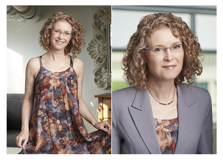
Tip #3. If you are wearing a shirt and tie, try to wear a well fitted shirt.

I am trusting readers to have sense of humour about my photo illustrations, so thank-you! The reality is that sometimes we can mitigate these particular shirt wrinkles by tugging on the fabric, but depending on the shirt and how much extra fabric there is those wrinkles can reform pretty quickly and they just do not look good. Yes, sometimes there’s a budget for retouching to take care of these eye sores, post-shoot, but sometimes there isn’t. (I see these ALL the time in people’s business portraits and they do not contribute to the message the subjects are meaning to broadcast unless the message is that they don’t care about details.)
I understand that business fashion trends are changing and there is a move away from the long established shirt and tie uniform. So maybe this will be less and less of a thing going forward. But whether you wear a tie or not, if you have the choice of a shirt that sits flat, wear that one!
Tip #4. If you are wearing a shirt and tie, wear a plain, not patterned shirt.
Once again, please view my photo illustration with a grain of humour as I demonstrate this tip wearing my husband’s clothes, again. The preamble for this one can be found in last week’s Tip #3. The gist of last week’s tip was to avoid wearing shirts that bunch around the tie and collar. But sometimes it is just not possible to avoid some wrinklage and bunching that area. In which case, as long as there is some retouching budget those wrinkles can be retouched out, UNLESS the shirt is patterned in which case they will remain there in that photo FOREVER.

I cannot tell you how many times I have found myself during a shoot struggling to flatten out a patterned shirt and it is just not happening. Somehow the subject did not get the memo to avoid patterned shirts or maybe they thought I was overstepping my bounds and trying to dictate their style. Regardless, they end up with a portrait that features a wrinkled shirt. I challenge you not to see these wrinkles now that I’ve helped bring them to your attention! You may not even consciously realize why a portrait feels just not quite excellent when you view it when all along it’s those pesky wrinkles.
We can stop this! If you want your shirt to be retouchable just wear a plain one. And BTW, when I say plain I mean PLAIN, not a solid colour with a beautiful highly textured weave because that is effectively a pattern, too. If there is one day in the year you are willing and able to wear a plain white or coloured, tightly woven, texture free shirt, make it your portrait day.
Tip # 5 Wear a suit that fits.
Again, I can just hear the sarcastic chorus of “thanks for that obvious tidbit, Kathryn!”.
Please bear with me. The thing is for many of us, especially those of us with curvy bodies, it can be incredibly difficult to find a jacket that fits properly and doesn’t somehow bunch and pull in various spots. I have, for years now, photographed myself to illustrate blog posts and articles and it seems like every single time I start with a jacket I was pretty sure looked and fit fine only to discover it does something in a photograph that I consider distracting and unacceptably imperfect. And then I go through jacket after jacket finding the same thing. It can be one little area that no matter what I do I cannot make sit smoothly on my body so I acknowledge, this is not an easy ask.
Men’s suits do weird things, too, especially when the wearer has changed shape since they bought their suit, or it was just never a well fitted suit in the first place. So many lumpy suits I have seen. Even if we can get all the bumps pretty much smoothed out, especially with an ill-fitting or just not well made suit, as soon as the subject moves those unsightly bumps appear again.
 |
| I have tried every way of posing and pinning to mitigate the wrinkles in the two gray jackets and have found it impossible to get rid of them. You can't see their textures in these small photos but at any larger resolution they are apparent, and they make successful retouching too difficult and time consuming to be practical. |
Yes, I am a bit of a wrinkle-phobe. But I can tell you that a portrait in which the suit fits perfectly will outshine a portrait featuring a lumpy suit every time.
And yes, as always, if there is a retouching budget some fixes may be possible, but often suit fabric is textured or patterned which can make retouching of bumps and wrinkles difficult or impossible.
Also, I’m just going to make brief mention of another little thing now (this’ll be its own official tip later) as I am always telling fair haired people like me to stay away from black if possible yet here I am in my photo in a black jacket…the caveat is that if the best fitting jacket you have is black, then fine, wear it.
Tip #6 Watch out for “baked” in wrinkles.
 |
I know in my small photo they may not be super obvious but these pesky upper arm wrinkles are something I see all the time and which I think often don’t register for people as wrinkles to worry about. But they will show up in your photo and they will not look good. These are the wrinkles that form over time (ie. during repeated wearings) on the upper arms of suit jackets as a result of reaching forward, ie. being alive!
Most jacket fabrics have some kind of texture or pattern and these wrinkles can become quite deep and defined, making them next to impossible to retouch out. They are also generally strong enough to resist to simply being steamed out, so my advice is to check the jacket you plan to wear for your portrait well before your shoot and if you’ve got them, have your jacket professionally cleaned.
Tip #7 If you are wearing a jacket make sure you can comfortably do up a button. There are a number of reasons for this:
1. You will feel more confident if you are comfortable.
2. You will feel more confident if you know you look good (look good feel good!).
3. Especially if your portrait will be cropped as a head and shoulders image your face will be nicely framed by the ‘v’ of the neckline.
4. You will look more polished and pulled together with a neatly closed jacket. Ideally you want the fabric to sit smooth and flat, no stress pulling or buckling which can be difficult to impossible to retouch.

In case I haven’t made it clear enough in the photos the idea is that I needed to replace my pre-pandemic jacket with one that fits the new me.
Tip #8 Choose a jacket over a sweater.

Maybe you don’t typically wear a jacket to work, or you mix it up depending on what’s happening on a given day. My advice: on photo day go with a jacket. In fact even if you never wear a jacket you may want to consider wearing a jacket for your business photo. I know there has been and continues to be a partially pandemic inspired move towards more casual wear at work, but as mentioned in Tip#2 jackets smooth over and hide all kinds of potential distractions in a photo, and a jacket will just always look more professional than a sweater no matter how nice the sweater.
Tip #9. Higher necklines are always the safer option.

My example is a bit obvious but “bare” with me. Get it? The point I want to illustrate is that ideally a neckline will be fully contained within the frame of a portrait. This way your wardrobe helps to frame your face and the viewers eyes aren’t pulled off the edge of the frame. It is not terribly unusual to find that the neckline of a top that seems business appropriate IRL disappears off the bottom edge of a typical head and shoulders portrait crop. This can catch people by surprise, as can the apparent disappearance of the top under a jacket when that jacket is closed; we generally want the jacket closed to make a nice ‘v’ to frame the face.
My advice is to play it safe and opt for a higher neckline, even if just for photo day. Nobody will ever be distracted by your neckline being too high.
Tip #10 When looking for a neckline that works think beyond tops.
This is another tip that refers specifically to head and shoulders portraits. If you don’t have a top with a suitable neckline but you have a dress that does, even if it’s one you’d never wear to work, or with a jacket, try wearing that. With a head and shoulders portrait nobody cares what’s going on below the crop.
Tip #11 Add a splash of colour with a scarf.

A simple, colourful accessory like a light scarf can brighten up an outfit, and can dress up a top that might otherwise look a little overly casual and/or boring. A scarf may also provide you a way to work with a neckline that is a little sub-optimally low. The only caveat is that big, bulky scarves should be avoided. Most of us will not look better than we already do with extra bulk, and your scarf shouldn’t make you look as if you were in a freezing cold place for your portrait.
Tip #12 Avoid bulky wardrobe.
In the only one of my tips so far to feature a subject other than myself I share with my friend Dennie’s generous permission two shots of her from an actual corporate portrait shoot to which she, thankfully, brought wardrobe options. A distinctly creative executive Dennie first tried a favourite knit jacket. As soon as we looked at the computer we could see it did not look nearly as awesome as it does in real life. The thick semi-structured bulky knit was just not flattering in a photo. Option B, a similarly colourful but more structured, streamlined, tailored jacket was much more photogenic.
Tip #13 Avoid wearing white or black.

You’ve probably heard this instruction before and may have wondered why.
As with most wardrobe guidelines this is not a hard, fast rule, and it doesn’t mean NO white or black, it means try to limit the amount of white or black so that instead of being the predominant colour (or not colour) it constitutes more of an accent, for example a white shirt under a darker jacket. The extent to which this guideline should be followed can also depend on an individual’s colouring. We all know that our colouring will affect what colours and tones will work best on us, but in portraits there are specific technical and aesthetic reasons to avoid the extremes of black and white.
Technically, white reflects so much light and black sucks in so much light they can look either too light and washed out or too dark and heavy when the rest of the image is exposed correctly. With photography there are technical limits to the range of tones that can be correctly, relatively rendered within an image. Generally, an exposure will be set to correctly capture the average, or middle tones which can leave the ends of the spectrum, ie. white and black, less optimally rendered.
Aesthetically, what we’re generally looking for in a portrait is a pleasing balance and for the focus to be directed to the subject’s face. Someone with dark features and hair may be able to wear black more successfully than a very fair person, because at least there will be a balance of tones, but it’s also possible the overall portrait could lack visually appealing contrast if skin, hair and clothing are all dark, or conversely if skin, hair and wardrobe are all very pale. On me, with my fair skin and hair, while wearing black clothing does create contrast in my portrait, it’s too much; the black clothing looks overly dark and heavy. At the other end of the spectrum, a bright white shirt on almost anyone may draw the viewer’s eyes away from rather than towards the face, while distractingly being the brightest part of the whole image.
The colour and tone of the background can also affect what colour and tone of wardrobe will work best, but in many cases portrait subjects won’t know what the background is going to be until they get to the shoot.
So, in general, I suggest the safest bet is to aim for mid-tones. Just about anyone can rock a mid-tone, and more often than not a mid-tone will stand out from whatever kind of background one ends up in front of.
Tip #14 Avoid short sleeves (for head and shoulders portraits).

Here’s a tip for anyone planning to wear a dress or top (no jacket): avoid short sleeves for head and shoulders portraits. Why? The crop is probably going to be somewhere above your elbow. As such, it can be a bit distracting for viewers if the bottom left and right corners feature the skin of your arms, especially if your skin is noticeably lighter or darker than your clothing. Instead wear long sleeves. They will almost always be the most flattering option.
Funnily enough I realized after I posted this that I didn't even acknowledge sleeveless dresses or tops. I apologize for the oversight. I think I neglected to mention them because it has been pretty universally advised for a long time that sleevelessness be avoided in business portraits. Some companies' corporate photo guidelines expressly forbid them. While setting up my next tips shot I was reminded of the huge number of sleeveless tops I own due to my being pretty high energy photographer (who gets hot when shooting), and the uselessness of those tops for portraits. Unless you are a fitness coach your sleeved arms will probably look better, and simply more professional than unsleeved arms.
Tip #15 Watch out for ill-fitting and/or visible undergarments.
This may sound a bit personal and obvious but I can tell you from experience that it’s worth mentioning because I know nobody wants their underwear to show through in a professional portrait. And sometimes it does. Can we fix it in Photoshop? Sometimes. Is there a sufficient retouching budget? Sometimes. But why risk it?
Since we’re talking about something kind of awkward I’ll share a somewhat relevant personal experience. Over the years I have acted in the odd TV commercial and when it was time for wardrobe we had to come prepared to don whatever clothing was selected for us. As such we were supposed to be responsible regarding our undergarments. One day I showed up to a shoot wearing my usual ‘acting bra’ …it was a utilitarian skin-toned thing that fit OK, even though the elastic on the straps was a little past its best before date. It got me through the auditions and the wardrobe call so I thought it would be fine at the actual shoot. Unfortunately the wardrobe stylist did not agree and lit into me about my lack of professionalism, saying she could not even imagine what would possess a person to show up to a job wearing a bra that didn’t fit perfectly. I couldn’t believe how hard she tried to make me feel bad for having slightly sloppy straps that didn’t even show. But I got the point…underwear matters.
 |
| Left: Lumpy bra. Middle: Properly fitted bra. Right: Loose fitting top, no sign of bra. |
I would not ever want to contribute to anyone’s ever feeling the way I felt that day, but it behooves me to mention the importance of underwear BEFORE any upcoming photo sessions with the intention of helping people work around ending up with show-through in a portrait. My suggestion: either wear a smooth fitted bra that doesn’t pinch, or, if every bra you have creates bumps, and you are not wearing a jacket, maybe wear a looser, less form fitting top. There are a lot of tops through which underwear shows a bit. You will probably love your portrait more if you choose one of the other ones.
Tip # 16 If you sometimes wear a necklace with your outfit(s) bring one (or more) along.
Unless you simply do not have and/or wear jewellery it may really help if you bring along a couple of options just in case. This way we can avoid anything along the lines of “I would usually wear a necklace; I don’t know why I didn’t bring one,” (yes, I have heard these words) when the bare neck area in a portrait shows more plainly than we’d anticipated.

I myself don’t really like wearing necklaces, but I have to concede that popping a necklace on to fill in the bare expanse of my pasty decolletage in a head and shoulders business portrait does really help.
And why do I suggest options? As I say in other tips, it can be surprising the way things that work in real life work less well in portraits, and vice versa. It can be hard to know for sure what will shoot well until you see it on camera. The best way to avoid disappointment -- bring options!
Tip #17 Expect to be surprised. Especially if you don’t have a lot of experience being photographed professionally, or you hide every time you see a camera.

There are a number of reasons you may not look in your portrait(s) the way you think you look:
a. Your face in the mirror and your face in a photograph will not match because one is a reflection. (I know…duh…but I think this disconnect can impact people’s perceptions.) So, for example, in the mirror while you see your left side parting on the left, people looking at you see that parting to the right in their field of view. You may also hear a photographer refer to “camera right” or “camera left” which means right or left side of the picture -- your left and right respectively. Because most faces are asymmetrical, I think the more that is the case the more disconcerting it may be to see your face the other way around. Everyone who thinks they have a “good side” you know what I’m talking about!
b. In a still photo you are looking at a 2 dimensional representation of yourself whereas in a mirror or video call you look more 3 dimensional largely due to movement which provides you constantly changing views of yourself supporting your perception of depth and shape.
c. If you compare what you see in selfies and video calls with a professional photo you may notice that the shape of your face (and features) looks different. Lens length is a big reason for this. Webcams and smartphone cameras generally use wide angle lenses (eg. 24-35mm), human eyes are comparable to mid focal length lenses (50mm), and portraits are typically shot with longer lenses (eg. 85-200 mm). Different focal lengths can hugely affect the apparent shape, depth and perspective of objects. Longer lenses which compress objects have for a long time been considered (generally) the most flattering for portraits.
d. The difference you perceive may also be because of lighting. The professional lighting a photographer chooses to use for your portrait may be different from what you are used to seeing, or from what another photographer may have used. Lighting is EVERYTHING and can hugely impact the way you look depending on the quality and angle of the light.
e. The camera angle may be different from what you are used to.
f. Your demeanour and expression may also not be what you’re used to seeing. How often do you really see your best, most confident, sh*t together self?
The bottom line is that it’s not really surprising that the combination of tools and techniques used by professional photographers may render you in such a way that you don’t fully recognize their version of yourself.
When I was contemplating the concept of “not looking like one’s self” in a photo I thought of an example of this happening in life. Have you ever come upon a mirror in a shopping mall or store somewhere and been surprised at the stranger you see reflected back you, and not in a good way? I have! It can be disconcerting and kind of depressing when you catch a glimpse of your dishevelled self schlepping through a store lit with grossly unflattering overhead fluorescent lights. That’s not me! Or at least I hope it’s not. Or maybe it is, on that day, in that light, in that place, and that’s kind of the point. How we look is not fixed.
I ask again, how often when you are looking at yourself in the mirror are you seeing the shining, confident, most powerful version of yourself? How many people have an accurate sense of how they show up to other people in the world, either visually or psychologically? Consider that to some extent everyone sees everyone differently because no two sets of eyes and brains will perceive anything or anyone exactly the same way.
The photographer’s job is to use their skill and experience to draw out of subjects their best selves from their professional point of view…to bring out their inner super-person. There are objective and subjective criteria they are looking for on the mental checklist they are using to determine when they’ve captured a winning shot based on their practised study of subtle cues that communicate traits and qualities such as confidence, happiness, intelligence, approachability, overall awesomeness, etc.
So ultimately, unless you always look like a million bucks, and somehow magically always look exactly the same, everywhere, all the time, please consider that it may not be a bad thing to be surprised by the you that you see in your professional portrait. Hopefully in a good way!
Tip #18 Avoid long necklaces.

This tip is relevant to head and shoulders portraits, and refers specifically to the issue of wearing a necklace too long to be included within the frame of a head and shoulders portrait crop. It kind of wrecks the effect of a beautiful necklace or pendant if the pretty part gets chopped in half or cut out of the picture entirely. Not to mention that the viewer’s eye is drawn off the edge of the portrait. Sometimes we can tape a long necklace at the back of the neck to make it hang shorter but that doesn’t always work. To avoid disappointment, wear shorter necklaces for headshots.
Tip #19 If you have more than one pair of glasses wear the least reflective ones.

I believe if you are a regular glasses wearer you should wear them for your photo…if everyone who meets you sees you with glasses on then that’s the you we want to capture.
If you happen to be someone who has different pairs to choose from and one has smaller and/or less reflective lens coatings bring those. (Bring them all if you’re not sure.) While there are some things a photographer can do to minimize reflections those solutions can limit your options in terms of the angle of your head and your face relative to the light. For example tilting your chin down may help get the glare off your lenses but make you look timid or coy, and by the time you reach an angle that gets rid of the glare the top of your eyewear frame may be bisecting your eyes. The more flexibility there is for the photographer to find your best angle the better.
Remember to make sure your frames and lenses are clean. Dust specs and smudges can show up surprisingly well under professional lighting. And if you do regularly switch between glasses and contacts then OK, maybe choose the contacts.
Tip #20 Avoid big patterns.
Once again the idea is to avoid wearing anything in a portrait that takes viewer’s eyes off your face. Big, bold patterns can be very eye catching…fun IRL, less conducive to an effective portrait. I’m not saying no patterns…just not big, loud ones.

Additionally, at the opposite end of the scale please avoid small patterns as well as they can do weird things that show up, sometimes really badly and distractingly, and sometimes unexpectedly when digital photos are resized.
 |
| Example of moire by photographer Kate Dyer |
Tip # 21 Work with a professional make-up artist (if you’re not doing it yourself, and if you wear make-up, or if you could just use a little aesthetic help).

Before there was a pandemic there were typically three options for portrait make-up depending on your budget – DIY (free), department store make-up counter (token product purchase), and professional make-up artist (professional fee). Mid or post pandemic (wherever we are now) I don’t even know if you can still get a make-over at a make-up counter but even if you can a note of caution: their agenda may not be the same as that of a professional make-up artist who has nothing to sell. (I’m just saying.)
It can be fun and kind of a treat to get your make-up done but remember what you are trying to do…show your best authentic self to the world…yes to refreshed and maybe a bit enhanced…no to looking like someone unrecognizable to you or to anyone you know or may come to know. A good make-up artist can help you show up as your best self while still looking like yourself.
They can make you look as if you are wearing just the right amount of make-up for you, wherever that is on the spectrum from practically none to…the other end. The key is communication between you and the stylist.
And for those who may not want to communicate with or be anywhere near a stylist I’ll just say that a little professional skin moisturizing and evening out of skin tones can go a long way towards uncovering your best self.
On another note, thankfully, the trend to straighten hair for work, and thereby work-related portraits, seems to be reversing so there’s less chance of disappointment from photos depicting straight-haired, make-up covered people who never normally look that way. I have photographed countless curly haired people disguised as straight haired people who tell me that we actually have the same hair! Always a surprise.
While I do say in Tip #17 that there are some reasons you may expect not to fully recognize yourself in a professional portrait it shouldn’t be because you have literally become someone else on portrait day. You want to feel confident putting your portrait out into the world, not feeling like an imposter.
Tip # 22 Choose a morning portrait session if possible.

I acknowledge that there are many, many things that might preclude a person from landing a portrait session that is earlier in the day. Maybe the time for your session is not in your hands at all. The thing is, facial hair that you are not intentionally sporting is very difficult to mitigate in retouching, and it’s not something that would typically be included in a standard portrait retouch. If you can’t get an early shoot time, maybe consider shaving a little later in the day. You will look more polished and professional and reduce the possibility of paying more for retouching or getting an over-retouched looking portrait if a retoucher has to smooth out your stubble.
Tip #23 Keep jewellery simple.

Unless you are a jeweller looking to advertise your work via your business portrait then the general guideline is to stick to more understated jewellery. I acknowledge the welcome movement towards people bringing their whole, unique, authentic selves to work, personal style and all. But the most consistently you part of you is your face. So to a large extent that’s where you want people’s focus. The added advantage of wearing subtler jewellery is that it will be less likely to date your portrait when styles change. While Fashion Magazine’s May 2022 issue said that “statement necklaces are back in style”, I suggest that this be considered less relevant to us in business portrait world. Avoiding wearing trendy jewellery or wardrobe is one good way to stave off having to do a new professional portrait every year.
Tip # 24 Moisturize your lips (and face).

Chapped lips are not good for photos.
I will always remember my grade 5 school photo which happened a reeaaaallly long time ago yet this is what stuck with me…a bunch of us had really chapped lips due to the cold, wintery weather, so in the photo we have these pinched expressions, our smiles constricted by lips so dry we couldn’t stretch them into smiles. Especially for those who don’t wear lipstick lips can get very dry particularly during certain times of the year. A dash of Chapstick or lip balm of some sort will free your lips to smile and just make your lips and you look way healthier. This goes for the rest of your skin, too. Dry, flaky skin is far less indicative of your good health and overall awesomeness than glowing, healthy looking skin.
Tip #25 There is no “unphotogenic”.
Interestingly, when I went to Google the dictionary meaning of “unphotogenic” the first thing that popped up was an article by another photographer talking about her many clients who hate themselves in photos or hate being photographed, to which she responded the same way I had…ie., there is “no unphotogenic”.
I have met so many people who think they are unphotogenic and what I hear are negative self-judgements and expectations based on all the nefarious influences that have us comparing ourselves to others and to supposed ideals.
I get so excited at portrait shoots when subjects relent and release their inner awesome, and from my non-judgemental POV it’s that confidence and strength shining out that make the photo. Nobody cares if your tooth is crooked or your eyes are slightly closer together then Michelle Pfeiffer’s or your jawline is less defined than Tom Selleck’s. That’s not what people are looking for when they look at your portrait. They are not comparing you to whatever/whomever you compare yourself to when you look in the mirror or at a photo of yourself. They are looking for a photograph that inspires respect and a desire to connect. That’s what we want to capture and depict. Are all the famous, interesting and attractive people in the world “perfect” looking? No they are not!
There is no unphotogenic. You are no more unphotogenic than you are unsuited to be seen in the world. You know what’s unphotogenic? Poutine. Gloopy brown stuff and globs of white stuff on yellowy sticks of potato. Nobody looks like poutine.
If you have photos of yourself that make you think you are unphotogenic that just means they are not good photos…it’s not you…it’s the photo(s).
I will refer the reader all the way back to Tip #1: Breathe…and trust. And also to Tip #17: Expect to be surprised. Chances are the photographer can work to mitigate whatever you think you have going on that is making you “unphotogenic” (like “crooked” features…I hear that a lot) but even if not, and if there is something that’s really bugging you, there are many things that can be done quite quickly and easily in Photoshop; I almost hesitate to say this because I don’t want to reinforce an expectation that all photos are or should be slated to be Photoshopped. It likely will be an extra expense and you should expect to pay if you need extra work, but just know that some things can be fixed in a jiffy for little cost, if they really are bugging you.
So yes, when clients tell me that they are unphotogenic the first thought that pops into my mind is that there is NO WAY we are not getting a good photo of them.

In my example I have pointed out the most apparent “flaw” that shows up even in these tiny sample photos, which is the obvious asymmetry of my face (most faces are asymmetrical), particularly my eyes, one of which appears considerably larger than the other. It’s so exaggerated it almost looks as if I Photoshopped it to make this point but I didn’t. It’s just angle and lighting.
Some of the other things you’d see if you could zoom in on my photo (always assume someone might click on your LinkedIn photo to see it larger) are slightly saggy, puckery jowls (often fixed merely by smiling), wrinkles, laugh and frown lines, uneven skin tone, and under eye bags all of which were mitigated by changing lenses, using soft portrait lighting, and finishing up with a very light retouch. I even added a little top lid eyeliner in Photoshop (which I forgot to put on before I shot) so I’d look less tired and a little more bright-eyed. That took about a second.
The bottom line is that if you can set aside the idea that you are unphotogenic and allow your awesome self, whatever you look like, to shine through, your photo will be as compelling and unique(!) as you are.
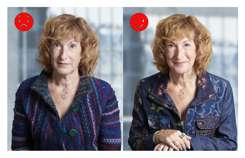
Tip #26 Lean in.
Yes, this one’s really simple. Particularly when someone is really not excited or is, more accurately, filled with dread at the idea of being photographed, but is also committed to doing their best to get through it, their default posture can be rigid, back straight up and down, chin sucked in, at attention! But this stance can make people looked timid, uptight and freaked out. We may be all these things, but we don’t want to look like it!

We can make great headway towards appearing to be the total opposite by merely leaning in. We want to look relaxed, confident and engaged, and step one to appearing to be those things is a bit of a tilt forward, back still straight, shoulders back, hinging from the hips, allowing the chin to come forward a wee bit so the angles of your jawline will be nicely defined above your tension-free and extra-chinless neck.
Tip #27 Angle down.

I’m talking about the camera angle. Of course you are not going to dictate to a professional photographer how they should be shooting, but if you are working with someone who is not sure or you find yourself shooting your own portrait angling the camera down can really help define the angles of your face and hide those extra chins.
There may be limits (visually and aesthetically) to the amount a camera can be tilted depending on what kind of background you are working with but, in general, a high camera angle is often more flattering (as practised selfie shooters will already know).
Tip #27b Angle your body.

This really is the cherry on top of the previous pose hints: whenever you see a camera pointed at you turn your body a bit. It’s usually more flattering, and it’s always more dynamic.
Tip #28 You probably want to wear your hair down.
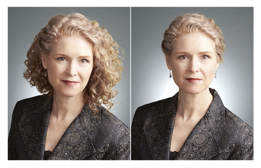
Clients often ask me if they should wear their hair up or tied back, or down. And here’s my answer: The thing about wearing your hair tied back in a still portrait is that nobody can see your long hair unless you turn your head well away from the camera, so you will likely appear to have really short hair. In real life as you move, turn your head etc., people can see your lovely long hair, but not when your head is frozen in position blocking it from view in a photo. Doesn’t mean you can’t choose this look; it’s just something to consider.
Also, in case this helps, remember that in a photo nobody can see the back of your head, so even if you are having a sub-optimal hair day if you can just make it look good in the front you’ll be all set, at least for your photo!
Tip #29 Don’t touch your hair.

I am well aware that the last thing clients want to have to do is keep a rolodex full of instructions in their heads while being photographed, but I felt compelled to offer this tip in hopes that it may save some time and grief for subjects, hair and make-up artists and photographers. Especially for clients with longer hair it can take some time to get it styled just so. While the goal is to stay calm and relaxed and open to some spontaneity the
caveat would be to try to avoid spontaneously touching your hair once it’s styled. It is…disheartening…to have to put on the brakes, and restyle hair that has been unstyled in a moment of abandon and/or stress. That quick tuck of the hair behind the ear, or flipping long hair from one side to the other can halt an otherwise smooth flowing session.
The bottom line is that it is not a disaster if you mess up your hair. It can always be unmessed, and I know people have subconscious mannerisms that are somewhat out of their control, but if you can somehow summon your inner non-hair-toucher, you may find yourself gliding more successfully though your session and helping a lot to ensure a positive outcome.
Tip #30 Try really hard to avoid getting a hair cut from a new stylist right before you get a new portrait done. If there is a make-up artist at your session they may be able to rescue you but if not, I think most people know the potential for distress and disappointment here. I have seen it!

Tip #31 Touch up your roots or do a blend.

This is one more example of a simple pre-shoot fix that will help you avoid additional retouching costs (assuming retouching is an option, which it isn’t always). There’s not a lot to say other than to acknowledge that while sometimes a photo session sneaks up on you, or you know it’s coming and you just can’t get an appointment with your hair stylist, you will feel way more confident walking into your session sans the distraction of unintentionally partially coloured hair.
Yes, it will show in the photo, so yes, it’s worth doing something to mitigate a straight gray or other-natural-colour grow-out. Thanks to the timeliness of this topic right now you can find endless tips online for how to gracefully grow out your gray. So if at all possible, do what you can to get your lovely hairs playing together nicely.
And one very important caveat: To be completely clear, I am not in any way advocating for colouring hair for any reason other than that you want to.
Tip #32 Think about how and where your portrait(s) will be used. Plan ahead.
Obviously not everyone having a professional portrait done is in on the planning. So this tip is for anyone who is.
A little while ago I was contacted by someone who wondered if I could help. They had had professional portraits done and discovered after the fact that their website designer wanted the shots to be on a white background. Could I Photoshop out the dark backgrounds and replace them with white?
To their great disappointment my answer was not really; it could be done, but not in a way that would look good. The portraits, which were actually really nice, had been shot with a short depth of field (meaning sharp focus on the eyes surrounded by very soft, blurry edges, on a very dark background). As good as Photoshop is, there is just no good way to cut out a blurry edged subject on a dark background and make it look right on a light or white background. You’ve seen these obvious and distracting cut-outs. They do not communicate professionalism or attention to detail. As in my example here:

The old rule used to be that if you knew you may need to “close-cut” a subject and replace the background, you should shoot against a backdrop similar in colour and tone to the one that would be used to replace it. This can help, if you know in advance what the replacement background will be, but often that’s not the case. The other problem with this technique is that you can run into problems if the background you want to remove has any colours or tones similar to those in the subject’s skin or clothing; if it does it can be harder to separate the subject from the background. (This is why green screens are so effective; they are designed to be very clearly distinguishable from any naturally or normally occurring colours facilitating quick, accurate cut-outs.)
No matter what colour the background, if you think you will ever want to replace it with a different one you will have better results if the photographer shoots sharp (ie. more extended depth of field, sharp around the edges of the subject).
Some say shooting on white provides the best flexibility, but I don’t generally agree. For one thing thin-ish hair can look even thinner shot against a true white background. And often there will be a brightness around the edge of the subject that shows up in a weird way if you decide to put in a dark background.
Here is a more extensive set of photos to show what I mean. Once again because my sample photos are relatively small the “bad” ones may not look that bad to you, but viewed at full size the photos featuring background replacements from dark to light, and light to dark do not look very good.
 |
| Please click on this to enlarge so you can see the examples better. |
The bottom line is that you may be able to save yourself some pain (ie. time, cost and technical barriers) by having some idea ahead of time what final uses the portrait may have, and planning to shoot in a way that facilitates rather than limits flexibility.
Tip #33 Pick up the phone.
As with Tip 32 this final tip is mostly for the planners of a photo shoot.
I know that many people responsible for planning (corporate) portrait photo shoots for others or for themselves have a lot on their plates, one small morsel of which may involve, on occasion, hiring a photographer. So I understand the desire for the process from the first outreach to receipt of final files to be simple, quick and painless. I also get that there can be a need for several reasons, to make sure everything is in writing and everyone on the communications team (if there is one) is in the loop and on the same page. This is easily accomplished by copying everyone on the e-mail that is sent after the initial conversation between the main point of contact and the photographer.
What is there to discuss? The thing is, photography is, regardless of the genre, always to some extent an art. No two shoots are the same and no two photographers are the same. They may not shoot the same way or work the same way. Especially as technology and styles change. Not only that but as a client pointed out to me recently, the language of “photography” may not be one hirers of photographers necessarily speak. Even “just a headshot” requires consideration of a number of parameters, and logistics. In fact I avoid using the term “headshot” for the very reason that its tendency to be prefaced by “just a” can set expectations low and can limit people’s patience for embracing the process required to achieve excellent and appropriate-to-your-unique-business results. I feel so strongly about this I wrote a blog post about it.*
I’m sure most readers have been party to e-mail threads that stop and start, grow longer and longer, and stretch across more and more time due to missing or incomplete information, unanswered questions, misunderstandings, delayed responses, over-simplifications etc. causing great irritation and wasting everyone’s time as they inch painfully towards finalizing a plan. I have witnessed this first hand. I have enjoyed much more being on the receiving end of a client’s joyful appreciation that I picked up the phone right at the start allowing us to work through the options and nuances of tackling their particular job so they could quickly and efficiently get on with booking the perfect shoot for their executive team.
So even though firing off an e-mail can seem more efficient in the moment, if your photographer suggests a chat when you start to plan your next shoot, do yourself and the photographer a service and pick up the phone. Taking the time at this stage will almost certainly save you time in the end!
And so dear readers, that’s about it for now.**
*http://khollinrakemakemepretty.blogspot.com/2022/01/getting-right-headshot-more-author.html
** Or is it? It is not!
I’ve got one more bonus tip for 2023!
Tip #34 How much space do you need for a portrait shoot?
There is no one answer to this question, but for the purposes of providing a guideline for simple head and shoulders business portraits I suggest that in a perfect world you’d have a space not less than approximately 8x16 feet.
Here is a picture of a pretty ideal space. What is great about this room?

It is spacious.
It has a high ceiling allowing for photographers’ sometimes tall lighting set-ups.
There are also no low hanging light fixtures which can get in the way of those photographers’ lights.
It has white walls and ceilings which are great for bounce light, ie.: soft, flattering light achieved by pointing lights at ceilings and walls (to be reflected back onto subjects).
Lights in the room can be turned off so they won’t interfere with the photographer’s lighting; sometimes pot lights and fluorescent lights (less so) can interfere with and overpower photographers’ lights.
The furniture is movable.
The furniture is contemporary and aesthetically pleasing and simple, so could potentially be incorporated into environmental portraits if that’s what you’re doing (as opposed to portraits against a backdrop which would also fit easily into this space).
There are lots of big windows on different sides of the room so if a photographer did want to use natural, available light, alone or combined with flash, they’d have that option.
What is less great about this room?
While white walls are great for bounced light, they are aesthetically really boring. Nice furniture will not make up for white walls, especially for head and shoulders environmental portraits in which you’d see only the walls in the background. And in case you are thinking that art on the walls may help, remember that copyright in art is often owned by the artist (or their estate) so it may be inadvisable to include art in professional photos. (In my example image here I made sure to replace the images on the wall with my own images.)
There don’t appear to be blinds on the windows in this room, so at certain times of day there may be direct sunlight flooding the room. Rarely is direct sunlight conducive to portrait photography (at least not for business portraits); it’s too harsh and will often overpower photographer’s lights.
What might be a seasonal issue: if windows will feature in the background of the portraits can you see trees and are there leaves on them? Spindly leafless trees can look very sad and distracting…just something to keep in mind.
The bottom line in terms of booking rooms with or without windows, and with or without available, natural light, is that professional photographers generally don’t need natural light to do portraits, particularly head and shoulders portraits, especially if they are looking to create a consistent looking set of images (eg. multiple people for a company website). (Natural light is notoriously unreliable and inconsistent.)
Something else to consider: will there be a Hair and Make-up artist? If so you’ll want a well lit place for them to set up physically separated from where the photography is taking place.
And on that note, it generally helps to make sure the photography space is physically separated from the rest of the office space. Privacy is critical to helping self-conscious photo subjects feel less exposed.
One final thought: for those who don’t have access to a room like this, which is lots of people, this is just an example of a super workable space for a fairly standard kind of business portrait set-up. This doesn’t mean other kinds of spaces won’t work; we work in much less pretty and/or spacious locations all the time (including in clients’ homes). Photographers can be very creative. But more space is more conducive to a comfortable and successful shoot. Talk to your photographer. They’ll help you figure it out.
Tip #35 Have high expectations, and be realistic.
Why when I thought I was done with the tips did I feel moved to write this one? Because there are just a lot of sub-optimal headshots out there and I ask myself why. In fact the author of a recent article in the Economist has clearly noticed the same thing but seems, erroneously, to have come to the conclusion that all headshots are bad (link below). They’re not. But why would they say that?
I think the problem is that many business portraits are done on a going-through-the-motions basis. A business concludes that they need headshots but don’t invest in them as if they actually matter. At the other end of the spectrum client sometimes ask “Can you make me look 10 years younger?” and “Can you make me look like Brad Pitt?” Yes, I know people are usually kidding, but I think the kidding does suggest a deep down fear of being depicted remotely truthfully (see Tip #25 There is no “unphotogenic”).
The thing is, I would suggest that looking really bad in a photo is no more authentic than looking ridiculously over-optimized. And neither extreme reflects the important job that headshots (ie. business portraits) have to do, which is to create for viewers the most positive and authentic first impression possible, and then, to support that impression.
If a bad headshot does more harm to a brand than it does good, why are they so ubiquitous? Was there no time, no budget, no buy-in from the subjects themselves?

In my photo illustrations here the first shot is “just a headshot” in the worst way…yes, I did err a little on the careless ‘underdone’ side to illustrate my point, which is that you can look really bad in a headshot shot that was done using “professional equipment”, and that you should expect more!
The second shot is the Goldilocks one, just right…care taken with lighting, pose, camera angle and retouching so that the subject looks like the best version of themselves.
And the third shot is the opposite of the first. It can be tempting to have a portrait optimized past the “authentic” finish line as you get caught up focusing on adjusting and removing “flaws” and “imperfections”. But unless you are literally never going to interact with your colleagues, clients etc. in person and/or on video, and you want to brand yourself as someone that you are not (ie. inauthentic), it makes no sense to have your portrait look so touched up it no longer resembles you.
Ultimately, it won’t serve you to have people be surprised when they do, inevitably, see you in person, either because you look way ‘better’ or you look way ‘worse’.
Treat headshots as important investments in your business. Expect
them to look good. And at the same time be realistic…don’t get hung up on
things you think make you look less like a young Brad Pitt/Elizabeth Taylor. (They
probably didn’t look half as good in real life anyway!)
*Sorry…The Economist’s paywall will mean you can read this only if you subscribe…but here’s the link for those who do: https://www.economist.com/business/2023/01/26/the-curse-of-the-corporate-headshot Note: If you want to read my paragraph by paragraph response to this highly problematic article please reach out to me directly.
Please let
know if I’ve missed anything or if you have any questions about preparing for and
getting the most out of your next professional portrait. I would love to fill
in any gaps. And if you’ve read this far I look forward to working with the
most prepared subjects any photographer could hope to meet!
#headshots, #corporateportraits, #corporatephotography, #personalbrandingphotography
kathryn@hollinrake.com
No comments:
Post a Comment