
 |
| Cover of CCNM's 2020 Annual Report |
Yes, I am going to write one more article on shooting portraits on green screens. Why? Because this is my favourite new way of shooting "environmental" portraits and I want to explain. I love environmental portraits, ie. portraits that look like they were taken somewhere other than in a photo studio. They tend to be more interesting, and more creative and more layered in terms of the story they tell. But for many reasons actually shooting in an appropriate and visually appealing environment is often either not possible, or it would be way more trouble than would be justifiable. Shooting on a green screen lets us visually put a subject where they want to be, regardless of time of day, weather, lack of a beautiful board room, or any other logistical concern.
It was green screens that made it possible for me to shoot one of my favourite annual reports ever this past fall, so I’m going to illustrate most of this article with examples from that project. Initially, due to Covid, the brief was that we’d have to shoot outside, or mostly outside. To be honest, I was horrified. You know if you read my previous post how I feel about shooting outside. On location…yes! Outside…really?…Is there really a good reason to shoot outside? In this case, yes.
The situation was that they needed over twenty beautiful, potentially full page portraits of individuals, no pairs or groups this time to be Covid safe although we did end up doing one informal socially distanced group portrait for the student association.
 |
| Informal socially distanced group shot outdoors |
I proposed we shoot on green screen for several reasons:
- By the time we were going to be scheduled to shoot fall would be well underway and it would look like it…leaves turned and falling or fallen off trees, foliage withered, flowers gone, duller looking days.
- There weren't very many pretty outdoor backgrounds to choose from at the organization’s campus where we’d be shooting, certainly not enough variety to do twenty plus distinct portraits.
- If we shot outside on the backgrounds that did exist we’d have to time all the shoots so that the light was right at each location at the right time…that would have made logistics much more difficult, and the time needed to shoot potentially much longer.
What was the process?
Before they even approved of the green screen idea I headed out, on a weekend, to start collecting background images because I knew if I waited I’d run out of opportunities and options. And they didn’t want fall backgrounds…they wanted summery backgrounds. Furthermore, I knew I’d be able to use the images as backgrounds for other shoots even if they chose to go in another direction. After I had a few initial background shots I photographed myself in studio dressed as If I were outside and mocked up a few test shots.
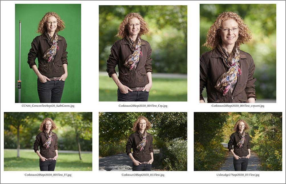 |
| Contact sheet showing rough concept/test shots |
This confirmed for me and for the client that the concept would work! So over the next few weeks, when I
had time and the weather was right I went out background hunting, driving to
parks and locations in and around Toronto. And when I could I grabbed site specific shots for them on their campus, until I had a nice selection. I wanted a variety
of looks, so sunny days and less sunny days, light coming from a variety of
directions but never full on frontal…ie. from behind me shining straight onto
the landscape. It needed to be coming from one side or the other, or from
behind, ie. backlit. I was always imagining what the scene would look like as a
background with a person in front of it. So I composed the shots as if there
were someone in the frame, focusing on the imaginary person, visualizing how
they’d fit, making sure there was unencumbered space for a person such that
nothing would be sticking out from behind their heads or looking distracting. And I shot some horizontal and some vertical.
Knowing that aesthetically we would want a very limited depth of field look for the portraits (ie. sharp person, blurred background, based on the inspiration shots in the brief…almost all close-ups with beautiful bokeh backgrounds) I was careful to shoot with a wide aperture, again always focusing on an imaginary person in the foreground. It was important to do it this way because blur created in-camera looks very different from blur created in Photoshop. If you want bokeh, those lovely lens-induced shapes you see in the out-of-focus parts of photographs, you need to shoot for them. (Yes, there are ways to add a bokeh layer when Photoshopping an image, but not in a way that would be practical or work with these types of images). So, to be sure I’d get what I needed I had to bracket the amount of ‘out-of-focusness’, in case what I thought would work didn’t make visual sense once I placed a person in the frame.
The other tricky thing is that the amount of background blur and bokeh that make visual sense vary hugely depending on how much of the person is in the frame. The bokeh photographers and film makers swoon over tends to occur in close-ups. But, the designers needed me to shoot everyone down to upper thigh, as again, they didn’t know ahead of time how any one portrait would be used. Generally the wider angle the shot, and the more space around the subject, the more in focus the background will be, so it doesn't work to have a ton of space all around the subject but have it be blurred out the way it would be when you shoot a close up of a person with a long lens and a wide open aperture. It just doesn't look right partly because it's not what we're used to seeing.
 |
| Left: Too much blur in the background to make visual sense behind a torso portrait. It looks fake. Right: Makes much more visual sense when cropped to a close-up. |
This meant I had to be very careful to shoot for flexibility, while not sacrificing aesthetics by shooting too wide and/or too sharp. I was also careful to include visual cues that might help the illusion of reality by, for example, ensuring foliage at the edges in the foreground remained sharp so that a sharp person placed beside it would look correct.
 |
| Foliage in line with the person is sharp. |
I did shoot some beautiful bokeh-heavy backgrounds for more close-up portraits in case they did end up being able to crop any of the portraits tighter. The way this one (below) fit in the layout allowed it to work perfectly.

I also had to think about the angle, and height of the camera vs. height of the people I’d be shooting, as some would be tall and some short, and I changed the camera lens for different looks noting I’d have to be sure to do some of the portraits with the different lens too. All this without knowing anything about the actual people I’d be photographing, where in the report they’d be featured, whether the images would be big or small, horizontal or vertical, closeup or medium view/torso.
Later doing the green screen shots, I basically randomly varied the camera angle knowing I had different angled backgrounds, and randomly lit them differently so that certain portraits would work better on certain background shots. Because I didn’t know which backgrounds would go with which people I just made sure I shot enough backgrounds that I’d be covered for sure. Ultimately I had a pile of assorted images of people and backgrounds to mix and match.
When it came time to start shooting the portraits the weather was in fact on the way to winter. Weather days (ie. postponements) were not an option, though, so at first we gamely did whatever we could to keep working outside including finding a slight overhang we could shoot under, unless there was wind AND rain. Regardless of inclement weather it was still a challenge shooting outside as we had to move the whole set repeatedly each shoot day to get out of the wind as it changed and out of the sun as it moved. We even had to secure the light stand to a fence at one point making it more time consuming to move. Although we did actually have a few sessions scheduled for inside, we ended up bailing on the outdoors one particularly frigid afternoon after braving the wind all morning. Luckily there was a huge, spacious, well-ventilated room we were allowed to use (while of course observing strict Covid protocols).
 |
| Left: Wind is blowing and sun has crept into the shot...no good! Right: Final shot...no cues that there was a gusting wind. |
 |
| Left: Green screen attached to a fence with wind blowing and tree branches encroaching. No problem...they're green! Right: final shot. |
I have to say, it did actually feel pretty great to be outside all the time that we were. I love being outside. I just don’t love the stress and possibility of compromise of quality and control that can come with shooting outside.
Whether we were shooting inside or out, we lit the portraits. Inside we had to be careful to light so that it looked as if we could have been shooting outside. And outside we still had to be thinking about shooting loosely for the various backgrounds I had collected. We also did at least one portrait outside that had to look as if it was done in studio.
 |
| It was freezing when we shot this outside, same spot as the shots above. |
Once I had all the people shot, selects made and retouched it was time for me to see who fit into what background and where they fit in the background. This was the fun part. Final images were submitted to the designers without cropping so they’d have maximum flexibility in terms of final crop and position in the layout.
 |
| Left: My final image which wasn't actually too far from the way it fit into the layout (right). |
And finally, some of the background shots were requested as-is to be used full bleed on copy pages which I thought looked fantastic.
 |
| Left: Original portrait. Middle: Final portrait. Right: Background shot used on copy page. |
I did have a brief moment of panic that this project was going to be way more difficult and time consuming to pull off effectively than I had thought (like the therapy dog calendar I did the same way, which was a nightmare!) but it wasn’t, mostly because of all the prep I did over-shooting backgrounds so that I was covered when a bunch of them didn’t fit or work.
Everyone followed the instructions not to wear green, and if there was a bit of green in a patterned top I just had to add one more step in retouching to put it back in after the chroma key software removed it. Same process for subjects who had green eyes.
 |
| Left: Original portrait. Middle: Green bits missing from the pattern on the top. Right: Final image in the report with the green put back in. |
Overall I was so happy with this project…thanks to the pandemic I kind of got to reconnect with the magic of photography…all those years ago it started when I watched a print appear in the developer tray, and because the shut downs gave me time to explore and experiment I came across this fantastic software that allows for near flawless chroma key knock-outs.
And I do want to note that while this project consisted of individual portraits the technique can work perfectly for pairs, as in this example from another project:
 |
| Covid-19 precautions meant we couldn't actually photograph these two subjects together. |
And could work equally well for small groups.
How does all this potentially help you?
I am now shooting more portraits on green screens than not. I love the flexibility, control and creativity this technique affords me. It gives me so many more options in terms of being able to create just the right overall look for any portrait depending on the client’s brand and particular needs. I can tailor the background to the person’s look, what they’re wearing, what feel is appropriate and what will really make their portrait sing.
The final portrait can appear to be inside or outside, so no worrying about whether the weather is going to cooperate, or what time of year it is. We can do a beautiful outdoor summer portrait at any time. Or I can put a person in an image suggestive of a nice looking boardroom without having access to one. Or if there's a gorgeous photogenic boardroom but it’s not available when the person we need to shoot in it is, I can shoot the boardroom when it’s free, and shoot the person separately somewhere else. For that matter any space that would make a great background, even one that’s not in a place where you could actually set up a shot for whatever reason, can be shot separately and composited in.
For this client (below) the backgrounds I chose were outside on
their office deck (it was winter and the day of the shoot it was raining, as it
happened) and at a height that would not be conducive to shooting portraits in
front of them, so on a sunny day, pre-shoot date, I went to the location to scout and shoot
background images (plates), and post-shoot I composited them in. This client also requested a plainer version of each portrait so I used a simple digitally created background as well.
 |
| Left: Portrait shot inside. Middle: Background shot outside on the deck at clients' offices. Right: Alternate, plainer background requested as an option. |
Another important technical bonus one gets from shooting on a green screen (or any plain background)…you can shoot using a higher camera angle (more flattering, especially for people with a little extra flesh under their jawlines) without having to worry about converging verticals. If you shoot down on a person in a real environment any vertical lines will be distorted in a visually distracting way, but using green screen, because the background is separate you can 'cheat', so this is a potentially more flattering way to shoot.
 |
| Left: Mock-up to illustrate what can happen to architectural vertical lines in a background when camera is looking down for a more flattering angle. Right: Final image delivered to client who was shot against green screen, and the vertically correct background image composited in. |
I know some people advise shooting on white for the most flexibility, but in my opinion I prefer green screen with a few exceptions (such as the need for a white background in the final image). We need less gear than you do to shoot on a white background and as a result can get away with shooting in a marginally tighter space. And unlike white backgrounds green screens don’t reflect white onto the subject (nor do they reflect green as long as you set up properly) which can fill in shadows where you don’t actually want them filled; in other words, when you shoot on white you can get highlight spill on the person around their edges which can make the cut-out look cut out. You don’t get this unwanted light spill with green screen so it’s easier to produce a final image that looks realistic. And close-cutting on white properly can take more time and add more cost than using high quality green screen removal software.
 |
| Mock-up to illustrate what can happen if a portrait is shot against a white background and the light spills/reflects onto the subject...she looks cut out against this dark background. |
And the final reason I love shooting on green screen: you can always go back and change the background in the future to refresh a portrait.
As mentioned, you've just got to avoid subjects wearing green clothes and watch you correct for and retain green eyes. The final caveat is that this technique definitely works best for portraits in which the subject is free standing or sitting, not interacting with the “environment” in any way like sitting on a couch or leaning against a table or wall. For those more lifestyley shots we’d still need to shoot on set.
And that's it for my green screen treatise! This was a long one…if you’ve read until the end, thank-you
so much! I hope this gives you a better understanding of some of the advantages of shooting on green screens. If you'd like to see more examples here's a link to a small portfolio PDF: https://hollinrake.com/green-screen-portrait-portfolio-pdf.
Please get in touch if you’d like me to help put you where you want to be!